

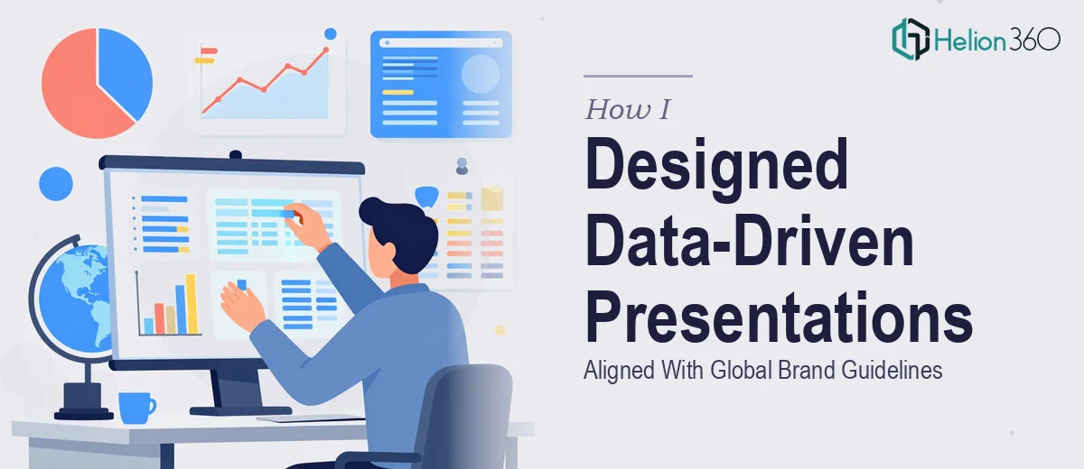
The Brief Looked Simple Enough — Until It Wasn't
I was handed a project that seemed straightforward at first: update existing PowerPoint templates to reflect a new product launch and revised marketing strategy. The decks needed to work across English and Spanish markets, align with updated brand guidelines, and translate complex data into something a live audience could actually follow.
I had worked with PowerPoint plenty of times before, so I figured I could handle it internally. A few template updates, some chart formatting, and we'd be good to go.
That assumption fell apart quickly.
Where the Complexity Kicked In
The challenge was not any single part of the project — it was all of them happening at once. The brand guidelines were detailed and specific: exact color values, font hierarchies, logo spacing rules, and layout grids that had to remain consistent across every single slide. At the same time, the data we needed to visualize was not clean or simple. It came from multiple sources, covered different regional markets, and needed to be represented in a way that was both accurate and visually digestible.
On top of that, the bilingual requirement added another layer. It was not just about translating text. The layout had to flex to accommodate Spanish copy, which consistently ran longer than its English equivalent, without breaking the design structure or pushing content off the slide.
I spent a few days attempting to build this out myself. I got partway through the first deck before I realized that doing this properly — at the quality level the launch required — was going to take longer than the timeline allowed.
Bringing In the Right Team
After hitting that wall, I came across Helion360. I explained the full scope: brand-compliant PowerPoint design, data visualization across multiple markets, bilingual slide layouts, and a product launch deadline that was not moving. Their team understood exactly what was involved and got started without needing a lengthy back-and-forth.
What stood out was how they approached the brand guidelines. Rather than treating them as a checklist, they used them as a design foundation. Every slide they built reflected the visual identity accurately — the typography, color application, spacing, and iconography all held together the way a professionally managed brand presentation should.
Turning Data Into a Clear Visual Story
The data visualization work was where the real lift happened. The raw figures I provided were organized into charts, comparison layouts, and summary visuals that were easy to read in a live presentation setting. Nothing felt cluttered. The information was layered in a way that guided the audience through the story rather than overwhelming them with numbers.
The bilingual versions were handled with the same care. Each Spanish slide was restructured — not just translated — so the layout continued to work without the text overflowing or the design feeling compressed.
By the time the final files came back, both language versions were consistent, on-brand, and ready to present.
What I Took Away From This
This project confirmed something I had suspected but not fully appreciated before: PowerPoint design at a professional level is not the same as knowing how to use PowerPoint. When brand compliance, data visualization, and multilingual requirements all intersect, the margin for error is small and the design decisions are much more deliberate.
Managing one of those elements well is achievable. Managing all of them simultaneously, under a deadline, while producing presentation-ready files is a different kind of work entirely.
The final decks were used at the product launch and held up exactly as intended — clean, consistent, and clear across both markets.
If you are working on a presentation project that involves brand guidelines, data-heavy content, or multilingual versions and you are finding that the pieces are harder to align than expected, product launch presentation design services can help. Or explore how others have tackled similar challenges: learn about data-driven insights with creative brand storytelling, or discover strategies for turning complex features into customer value. Helion360 took a complicated brief and delivered something polished and ready to use.