

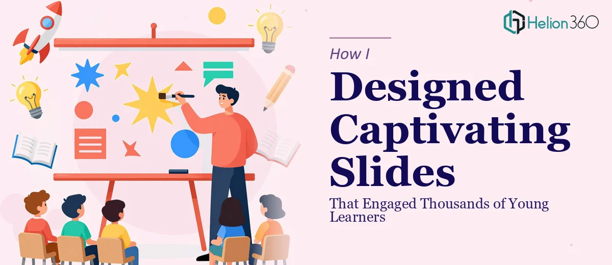
When a Simple Slide Deck Became Something Much Bigger
I was in the early stages of building an educational platform aimed at teenagers and young adults. The vision was clear — create an online space where learning feels less like a lecture and more like an experience. But to launch properly, I needed a set of visually compelling presentation slides for our first round of webinars, workshop sessions, and promotional materials.
I thought I could handle the design work myself. I had a general sense of what I wanted: bold visuals, clean layouts, content that felt energetic without being overwhelming. I opened PowerPoint and started building.
The Gap Between a Good Idea and a Great Slide
What I quickly learned is that designing engaging presentations for a young audience is a very specific skill. Teenagers are visually literate in a way that most slide templates don't account for. They respond to motion, strong contrast, layered imagery, and design that feels current — not something pulled from a corporate deck built in 2015.
I spent several days reworking slides, swapping out fonts, trying different color palettes, and attempting to create layouts that felt dynamic. Some slides looked decent in isolation but fell apart when viewed as a full deck. The visual consistency I needed — the kind that makes a presentation feel like a designed experience rather than a collection of slides — was beyond what I could produce in the time I had.
I also wanted to incorporate custom graphics and motion elements. That's where things got genuinely complicated. Working with Adobe Creative Suite at the level required for polished educational presentation design is a discipline in itself, and I didn't have the hours to close that gap before our first webinar deadline.
Handing It Over to a Team That Could Deliver
After a week of trying to force the project forward, I reached out to Helion360. I explained the context — an educational platform for teens, a mix of webinar decks and workshop materials, a need for visually stunning slides that could hold the attention of a demographic that's seen everything.
Their team asked the right questions from the start. What tone did I want — energetic, calm, playful, or authoritative? Were there brand colors or style references I was working with? How would the slides be presented — live on screen, or shared as download materials? Within a short brief, they had a clear enough picture to move forward.
What came back was genuinely impressive. The slides had visual weight and rhythm. Each section transitioned logically into the next. The typography choices felt intentional — readable at a distance, engaging up close. The graphics weren't stock-photo generic; they had a bespoke quality that matched the platform's energy. The deck worked as a whole, not just slide by slide.
What the Finished Deck Actually Achieved
We used the Helion360-designed slides across three webinars and two live workshop sessions. Feedback from attendees — mostly teenagers and young adults — was consistently positive about the visual experience. Several participants mentioned that the materials felt professional and engaging, which mattered for a platform trying to earn credibility with a skeptical young audience.
The promotional materials built from the same design system also held up well across different formats. That visual consistency turned out to be more valuable than I had anticipated at the outset.
What I Would Do Differently
If I were starting this type of project again, I would bring in design support earlier. The time I spent trying to build slides that met the standard I needed was time I could have spent on platform content, speaker coordination, and outreach. The creative presentation design work — especially for an audience as visually aware as teenagers — required expertise that goes beyond general familiarity with slide tools.
I also underestimated how much the design brief itself mattered. The clarity I gave Helion360 during the handoff directly shaped how quickly they could deliver something accurate. Coming in with references, a clear audience profile, and even rough slide outlines made the process faster than starting from scratch with vague instructions.
If you're in a similar position — building something educational or audience-specific and finding that your engaging presentation slides aren't matching the vision in your head — Helion360 is worth reaching out to. They took a half-built, inconsistent deck and turned it into something that genuinely worked for the audience it was meant to serve. See how I approached polished presentation design in other contexts for additional perspective.