

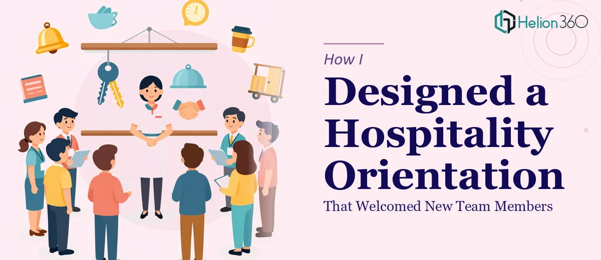
When Orientation Materials Need to Do More Than Inform
When our team started growing quickly, I found myself in charge of putting together a job orientation presentation for new hospitality staff. On the surface, it seemed straightforward — gather the key information, drop it into slides, and call it done. But the moment I sat down to build it, I realized the task was far more layered than I had anticipated.
Hospitality onboarding is not just about handing people a list of rules. It is about making new team members feel like they belong from day one. The presentation had to cover company culture, core values, daily operations, safety protocols, and department overviews — all without overwhelming someone who was starting their very first shift.
The Challenge With Building It Myself
I started with a standard PowerPoint template and began filling in sections. Company culture went on one slide. Safety protocols got a dense bullet-point breakdown. The department overviews became walls of text that no one would actually read during orientation.
After two hours of work, I had something that looked like an internal report rather than a welcoming experience. The slides were too heavy, the formatting was inconsistent, and nothing about it felt warm or engaging. For a hospitality team — where first impressions and human connection are literally the job — the presentation had to reflect those same values.
I also had a two-week deadline, and building slides from scratch while managing everything else on my plate was not going to work.
Bringing in the Right Help
After hitting that wall, I came across Helion360. I explained the project — what it needed to cover, who the audience was, and the tone I was going for. Their team asked the right questions upfront: What is the visual identity of the brand? How long is the orientation session? Should it feel corporate or casual and approachable?
Those questions alone told me they understood the difference between a generic presentation and one built for a specific purpose. I shared my rough draft, the brand colors, and some notes on the content, and they took it from there.
What the Final Presentation Looked Like
The difference between what I had built and what Helion360 delivered was significant. The final hospitality orientation presentation was structured in a way that felt like a conversation rather than a manual.
The opening slides introduced the company's story and values using clean visuals and short, punchy text — the kind of thing a new team member could absorb in thirty seconds. The safety protocols section used simple icons and clear layouts instead of long paragraphs, which made the information easy to scan and remember. Each department overview had its own visual identity within the deck, so staff could quickly understand where they fit and how the teams connect.
Throughout the design, there was a consistent warmth — imagery choices, typography, and color use that all said "welcome" rather than "sit down and read this document."
What I Took Away From This Experience
Building an engaging onboarding PowerPoint for hospitality requires a different mindset than building a business report or a data deck. The audience is emotionally invested from the moment they walk in. They are nervous, excited, and forming their first real impression of the organization. The presentation has to carry that weight visually and tonally.
I also learned that good presentation design is not just about making things look nice. It is about structuring information so it lands correctly with the audience — and for new hires in a fast-paced hospitality environment, that means keeping presentation slides focused, visual, and human.
The orientation session itself went smoothly. New team members were engaged throughout, asked questions during the department sections, and several mentioned afterward that the session felt welcoming rather than overwhelming. That is exactly what the deck was designed to do.
If you are working on hospitality orientation or any employee onboarding deck and find that your first draft is not quite hitting the mark, consider using an Onboarding Presentation service. Professional design support handles the complexity you cannot manage alone and delivers something that genuinely serves your team.