

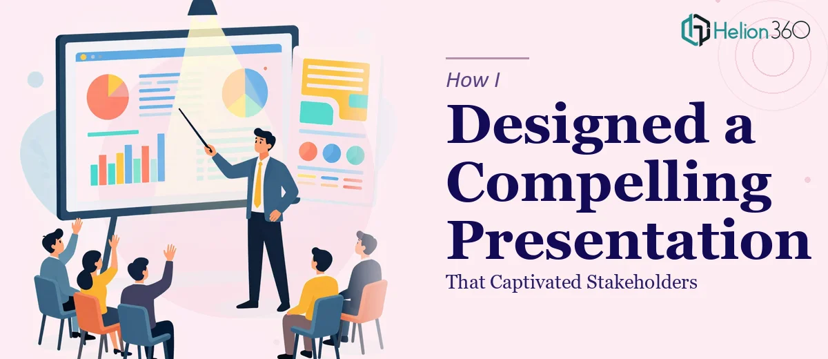
The Brief Looked Simple — Until It Wasn't
I had a stakeholder presentation coming up and a rough set of notes to work from. The content was solid — strategy updates, performance data, a few forward-looking initiatives — but getting it into a clear, visually engaging PowerPoint felt harder than I expected.
I know my way around PowerPoint. I can build a slide, drop in a chart, change a font. But this presentation needed to do more than just display information. It needed to tell a story, hold attention for thirty minutes, and leave the room feeling confident in the direction we were heading. That's a different kind of challenge.
Where the Process Started to Break Down
I started by drafting an outline and building a rough version of the slides myself. The structure made sense to me, but when I looked at it as a whole, the presentation felt flat. Slides were text-heavy. The data slides were dense and hard to read at a glance. The visual language was inconsistent — some slides felt corporate and clean, others looked like they belonged in a different deck entirely.
I spent a few evenings trying to fix it. I swapped fonts, adjusted layouts, found some stock images. But the more I changed, the more inconsistent it looked. The core problem was that I was designing slide by slide without a unified visual strategy behind the whole deck.
I also realized I wasn't thinking clearly about the audience. Stakeholders don't want to read — they want to absorb. A compelling PowerPoint presentation needs to guide attention, not dump information. I was building something informative but not something captivating.
Bringing in the Right Support
After hitting that wall, I came across Helion360. I explained what I had — a rough deck, a content outline, some brand guidelines, and a hard deadline. Their team asked the right questions upfront: who was the audience, what was the key message per section, and what tone did the presentation need to carry.
That intake process alone was clarifying. They weren't just asking for the files — they were thinking about the presentation as a communication tool, not just a design task.
What the Redesign Actually Looked Like
Helion360 took the rough deck and rebuilt it with a consistent visual framework. The color palette aligned with the brand. Typography choices were clean and readable from a distance. Each section opened with a clear visual anchor that told the audience what they were about to see.
The data slides were transformed the most. Instead of raw tables and default Excel charts pasted in, the numbers were translated into clean data visualizations — bar charts with clear labeling, callout stats for key figures, and simple icons to support context. Nothing decorative for the sake of it. Every visual element had a purpose.
The flow improved significantly too. Transitions between sections felt intentional. Each slide built on the last rather than standing alone. The presentation now had a logical arc — which is what makes an engaging PowerPoint presentation actually work in a room full of decision-makers.
The Outcome
The stakeholder meeting went well. A few people specifically commented on how easy the presentation was to follow. One person said it was the clearest strategy update they had seen from our team. That kind of feedback doesn't come from the content alone — it comes from how the content is structured and presented visually.
Looking back, the version I built myself wasn't bad. The ideas were there. But the gap between a functional slide deck and a compelling, professional presentation is wider than most people realize until they're staring at their own work trying to figure out why it doesn't land.
If you're preparing a high-stakes presentation and running into the same friction, Business Presentation Design Services from Helion360 is worth reaching out to — they handled exactly the kind of end-to-end thinking that turned a rough draft into something that actually performed in the room.