

The Idea Sounded Simple Enough
I had this vision sitting in my head for weeks: a series of five PowerPoint business card templates, each built around a playful theme. Not the boring white-card-with-black-text kind. I wanted zodiac signs, emoji-inspired designs, whimsical illustrated characters — cards that people would actually pick up, look at twice, and remember. The concept was clear. The execution was another story.
I figured since I already knew my way around PowerPoint, I could pull this off myself. I started with the zodiac-themed card. I had references, rough sketches, and a general color palette in mind. An hour in, I had something that looked more like a school project than a polished template. The alignment was off, the typography felt generic, and the illustrated elements I was trying to incorporate just did not sit right on the slide canvas.
Where the Work Got Complicated
The challenge with designing business cards inside PowerPoint is that it is not really what the software is built for. Getting the dimensions right, maintaining print-quality clarity, building layouts that could be reused across five different theme styles — all of that requires a level of design precision that goes beyond basic slide-making skills.
I tried adjusting the slide size, experimenting with custom shapes, and hunting for icon packs that matched the playful aesthetic I was after. By the time I had two rough versions done, I realized I was spending more time troubleshooting design decisions than actually designing. And neither template felt consistent enough to be part of a cohesive series.
That is when I reached out to Helion360. I explained what I was going for — five themed business card templates in PowerPoint, each with its own personality but unified enough to feel like a set. Their team understood the brief immediately and asked the right clarifying questions: preferred color moods per theme, how much illustration versus pattern work, whether the cards needed to be fully editable by non-designers.
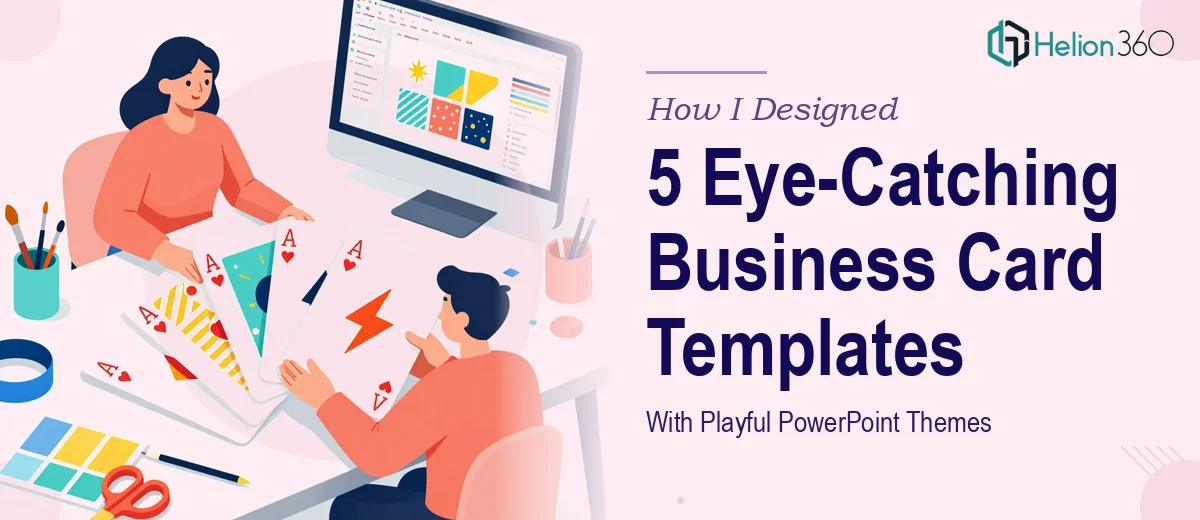
What the Final Designs Actually Looked Like
Helion360 took the project from there. The zodiac-themed card came back with constellation line art, deep navy backgrounds, and gold accent typography that felt premium without being stuffy. The emoji-inspired version used bold flat colors, rounded shapes, and a layout that was fun without feeling childish. Each theme had its own visual logic, but they all shared the same grid structure and font system, which made the series feel intentional.
The whimsical character card was the one I was most curious about — and honestly the most impressed by. The illustrated elements were custom, not stock, and they sat inside the card layout naturally. The design balanced creativity with readability in a way I had not been able to achieve on my own.
All five templates came back fully editable in PowerPoint, with labeled layers, consistent slide dimensions, and placeholder text that made swapping in real information straightforward.
What I Took Away From This
Designing inside PowerPoint is genuinely versatile, but there is a gap between what the tool can do and what most people know how to do with it. Custom business card templates with illustrated themes sit firmly on the more complex end of that range. The design decisions — spacing, color harmony, illustration style, template structure — compound quickly, and getting all of them right across five different concepts is not a small task.
What worked was having a clear vision and handing it to a team that could execute it properly. The themed templates I ended up with were better than anything I could have built on my own in twice the time.
If you have a similar project — creative slide work, branded template design, or any concept that keeps falling short of what you have in your head — Helion360 is worth a conversation. They handled the complexity so I could focus on how I actually wanted to use the final product.