

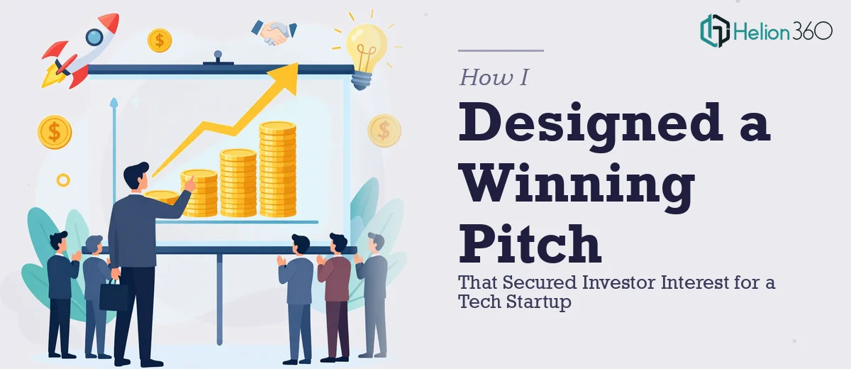
When the Numbers Were Ready but the Story Was Not
We had done the hard work. The financial model was solid, the growth trajectory looked strong, and the data told a genuinely exciting story about where the company was heading. But when I sat down to actually build the investor presentation, I quickly realized that having great numbers and presenting great numbers are two very different things.
As the founder, I had been close to this data for months. I understood every line item, every assumption, every trend. But translating that into a financial presentation that could hold an investor's attention for fifteen minutes in a busy conference room — that was a different challenge altogether.
What I Tried Before Asking for Help
My first attempt involved pulling everything into PowerPoint myself. I had a rough template from our earlier pitch deck, so I started adapting slides — revenue charts here, cost breakdown there, a projection table on the next slide. It looked functional. But functional was not going to be enough for this room.
The charts were cluttered. The slide with our unit economics was dense and hard to read at a glance. The color scheme was inconsistent. And critically, the slides did not build a narrative — they just presented data, one after another, with no sense of flow or emphasis. Investors do not just want to see numbers. They want to understand the story those numbers are telling.
I spent two evenings trying to fix it and kept running into the same wall. I knew what I wanted the audience to feel. I just did not have the design skills to make the slides communicate that.
Bringing in the Right Team
After hitting that wall, I came across Helion360. I sent over the raw financial data, my existing slides, and a brief explaining the context — a tech startup investor conference, a mixed audience of angels and early-stage VCs, and a need for something that felt polished and credible without being overdone.
Their team took it from there. Within the first day, they came back with questions that immediately showed they understood the brief: which metrics were most important to lead with, whether the revenue model needed a dedicated slide, how much detail was appropriate for the cost structure section. These were the right questions.
What the Final Presentation Looked Like
The finished investor presentation was a significant step up from what I had been working on. The financial data was still all there — nothing was simplified away — but it was structured so that the narrative built logically from the market opportunity through to the financial projections and use of funds.
The data visualization was clean and purposeful. Instead of standard bar charts dropped onto a white background, the charts were designed to highlight the key insight on each slide. The revenue growth slide emphasized the inflection point. The unit economics slide isolated the numbers that mattered most. The financial projections were presented with clear assumptions visible but not overwhelming.
The design itself was restrained and professional — the kind of visual treatment that signals competence rather than trying to impress with style. That balance was exactly right for the audience.
What the Presentation Achieved
We went into the conference with a financial presentation that we were genuinely confident in. The response from investors during the session was noticeably different from earlier pitches we had done with rougher materials. The questions we received were substantive — people were engaging with the strategy, not getting distracted by unclear visuals or asking us to clarify numbers that should have been self-evident.
Two follow-up meetings came from that session. The presentation did its job.
What This Experience Taught Me
Building a strong financial presentation for investors is not just a design task and it is not just a finance task. It sits at the intersection of both, and getting it right requires someone who understands how visual storytelling works alongside financial data. Trying to do that alone, under time pressure, while also running a startup, is a fast way to end up with something that undersells the actual work behind it.
If you are in a similar position — the data is ready but the presentation is not landing the way it should — Helion360 is worth reaching out to. They handled what I could not and delivered something that represented the company the way it deserved to be represented.