

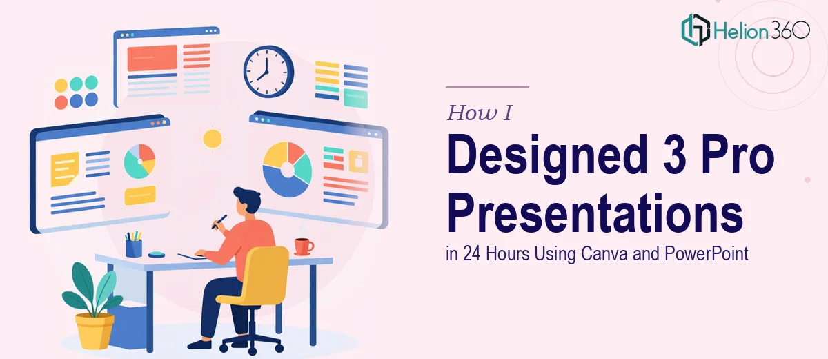
When Three Decks Land on Your Desk at Once
It started on a Tuesday afternoon. Three presentation briefs, one 24-hour deadline, and the expectation that everything would look polished, on-brand, and ready to share with real audiences.
The first was a redesign of an existing client-facing deck — the kind that had clearly grown in layers over time, with mismatched fonts, inconsistent slide layouts, and brand colors that had drifted from whatever the original style guide said. The second was a brand-new presentation covering upcoming product launches, meant to inform and excite stakeholders. The third was a tutorial-style deck walking users through key software features — structured, clear, and visually instructional.
Three completely different purposes. One tight window to get them done.
Where the Real Pressure Started
I'm comfortable working in both Canva and PowerPoint. I've built decks before — sales presentations, internal updates, onboarding materials. But three in parallel, each needing its own visual logic while staying within the same brand system, is a different kind of challenge.
The redesign alone required going slide by slide, auditing what was there, deciding what to keep, and rebuilding layouts from scratch without losing the underlying content. That kind of work is slow even when you know exactly what you're doing. The product launch presentation needed a structure that felt fresh and momentum-driven — not just informational, but compelling. The software tutorial deck had its own demands: screen-by-screen clarity, consistent annotation style, logical flow that didn't assume the reader already knew the product.
A few hours in, I had made real progress on the redesign but had barely touched the other two. The math didn't work. I needed another approach.
Bringing in the Right Support
That's when I reached out to Helion360. I had seen their work referenced in a few design circles and decided to contact them directly. I explained the situation — three presentations, different purposes, tight deadline, brand guidelines that needed to stay consistent across all of them.
Their team asked the right questions immediately. What tone did each deck need to carry? Who was the audience for each one? Were there existing brand assets to work from? Within a short exchange, it was clear they understood not just the visual side but the communication purpose behind each presentation.
I shared the brand files, the existing draft of the client deck, the content outlines for the product launch and tutorial presentations, and a few reference examples for the visual direction I was aiming for.
What the Collaboration Looked Like
Helion360 took the product launch and software tutorial decks off my plate entirely while I continued refining the client redesign. The division made sense — I was deepest in the history of that particular deck and could move through it faster than handing it off cold would allow.
What came back on the product launch presentation was structured well. The slide flow built genuine momentum — opening with context, moving through each launch with a consistent visual treatment, and closing with a clear next-step frame. It didn't feel like a generic template dressed up with new content. The layouts were built around the information, not the other way around.
The tutorial deck was the one I was most uncertain about. That kind of instructional design can easily become either too cluttered or too sparse. What came back was well-paced — each feature got its own focused slide, annotations were consistent, and the visual hierarchy made it easy to follow without a presenter walking you through it.
All three decks shared the same brand colors, font system, and design language. They looked like they came from the same team on the same day — which, in a sense, they did.
What I Took Away From This
A 24-hour presentation design deadline is not the place to learn new workflows or push through fatigue hoping quality holds. The work I delivered on my own was stronger because I was focused on one deck. The work Helion360 delivered was strong because their team approached it with fresh eyes and a clear process.
The lesson was straightforward: knowing when a workload exceeds what one person can handle well in a given window is not a failure of skill. It's just a realistic read of the situation.
If you're facing a similar crunch — multiple presentations due at once, or a single complex deck that needs more than you can give it right now — business presentation design services is worth exploring. They handled two-thirds of a high-pressure project cleanly and on time, and the output reflected that. For similar deadline experiences, see how others tackled polished PowerPoint presentations on tight deadlines and learned from professional PowerPoint template redesign.