

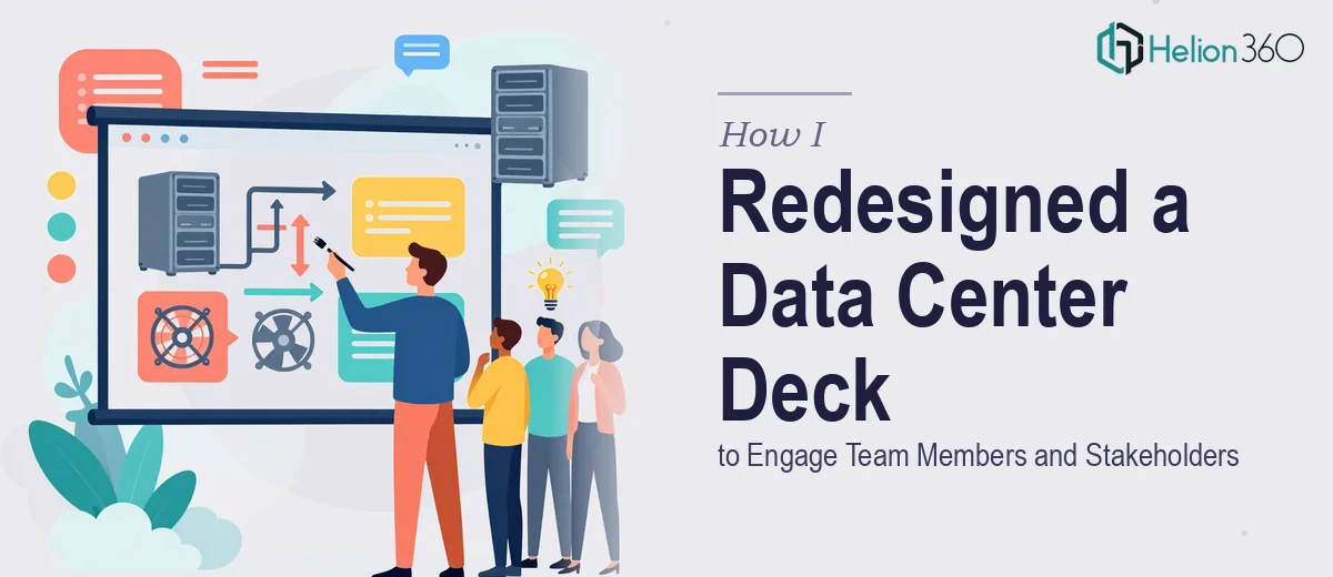
The Deck Was Functional, But It Wasn't Working Hard Enough
We had a data center presentation deck that had been in use for a while. It covered the right topics — infrastructure, processes, team responsibilities, capacity planning — but the way it was put together made it harder to absorb than it needed to be. Walls of text, inconsistent slide formatting, and a few charts that looked like they were dropped in as afterthoughts.
When a new team member was set to join, I figured it was the right moment to clean things up. This deck would be one of the first things they'd see, and I wanted it to actually communicate — not just exist. On top of that, we occasionally used it in external stakeholder meetings, so polish mattered there too.
What I Tried to Fix on My Own
I started by going through the slides myself. I cleaned up some of the language, tightened a few headings, and tried to improve the visual layout on a couple of key slides. For a few hours, it felt like steady progress.
Then I hit the harder parts. The charts we had were technically accurate but visually confusing — too many data points crammed into a single graph, no clear visual hierarchy to guide the reader's eye. I also realized the slide-to-slide flow felt disjointed. Some slides introduced topics that weren't fully developed, and others repeated information that had already appeared earlier.
Restructuring the narrative while also reworking the visual design at the same time was more than I could handle cleanly. I know what good data visualization should look like, but building it from scratch in PowerPoint — especially across 20-plus slides — takes a level of design skill and time I didn't have.
Bringing in the Right Help
After a few frustrating sessions staring at the same slides, I reached out to Helion360. I explained what the deck was for, what it currently looked like, and what I needed it to do — both for onboarding a new team member and for holding its own in external meetings. Their team understood the brief quickly and asked the right questions to get the context they needed.
What I handed over was a working document with good content but rough presentation design. What came back was a significantly more refined version of the same deck.
What the Redesigned Deck Actually Looked Like
The slide flow was restructured so the narrative built logically from one section to the next. Introductory context came first, operational details followed, and supporting data was presented where it was actually relevant rather than scattered throughout.
The charts and graphs were rebuilt with cleaner layouts — fewer elements per visual, clearer labels, and a consistent color system that made it easy to compare data across slides. The kind of data visualization that doesn't just display numbers but actually explains them.
Language across the slides was also tightened. Technical content stayed intact, but the phrasing was cleaner and more direct. Headers became more descriptive. The deck stopped feeling like a document that had been converted to slides and started feeling like something designed to be presented.
What a Better Deck Actually Changed
The new team member walked through the deck during their first week and came out of it with a much clearer picture of the environment they were stepping into. There were fewer follow-up questions than I expected — which told me the slides were doing their job.
For the stakeholder meeting that followed a few weeks later, the response was noticeably different from previous sessions. People engaged more. The data points landed better because the visuals supporting them were easy to read.
What I took away from the whole process is that presentation design for technical content is a specific skill. Getting the facts right is one thing. Getting those facts to communicate clearly — through layout, visual flow, and proper data visualization — is another challenge entirely.
If your team has a presentation that covers the right ground but isn't landing the way it should, Helion360 is worth reaching out to. They stepped in at exactly the point where I needed support and delivered a deck that actually worked.