

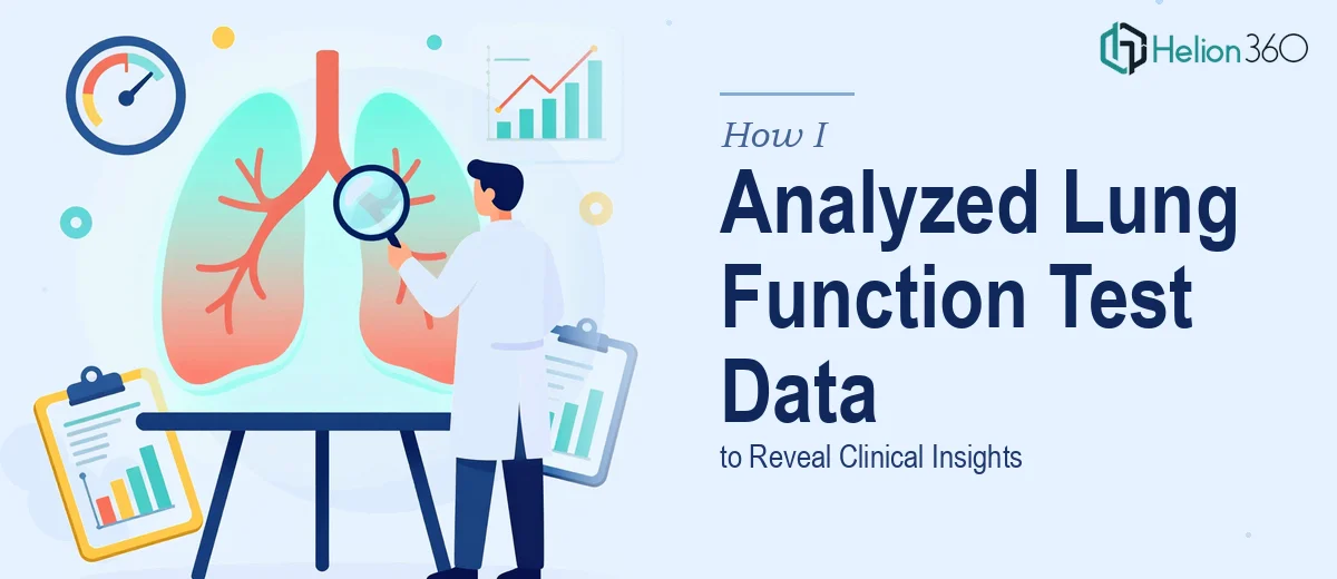
When the Data Was Bigger Than the Deadline
I was deep into the results section of a respiratory health research study, staring at a dataset that covered multiple lung function test metrics across a fairly large patient group. The numbers were all there — FEV1 ratios, peak flow readings, diffusion capacity values, comparative baselines — but the challenge was not collecting the data. It was making sense of it in a way that could actually communicate clinical meaning to a reader.
Research data at this level does not speak for itself. Raw outputs from pulmonary function tests need context, structure, and the kind of visual framing that turns a table of figures into a finding worth acting on.
What I Tried First
I started by organizing the data in spreadsheets and drafting charts manually. I knew roughly what the results were showing — certain patient groups demonstrated measurable differences in airflow obstruction, and there were patterns across age and test type that felt significant. I could write about them, but when I tried to lay them out visually in a presentation format, the slides looked cluttered and the logic did not flow.
The charts were technically accurate but visually flat. The annotations were either too sparse or too dense. And the overall results section did not build a narrative — it just listed outcomes without guiding the reader toward the key takeaway about respiratory health implications.
I also realized I was spending more time on slide formatting than on the interpretation itself, which was the wrong trade-off for a study that needed analytical depth.
Bringing in Specialist Help
After hitting that wall, I came across Helion360. I explained what the project was — a research presentation focused on lung function test results — and shared the dataset along with notes on which findings I considered most clinically relevant. Their team took it from there.
What stood out immediately was that they did not just reformat what I had. They restructured the entire results section with a clear visual hierarchy. Each finding was presented with the right chart type — grouped bar charts for cross-group comparisons, line graphs for trend data over time, and annotated visuals that highlighted the statistically significant differences without overwhelming the reader.
What the Final Presentation Looked Like
The finished results section was clean, well-sequenced, and genuinely readable. The data visualization approach they used made the lung function test comparisons immediately understandable — something I had been struggling to achieve on my own.
Each slide served a purpose. The flow moved from an overview of patient categories to specific metric breakdowns, and then to a summary of trends with clear labels pointing to what the numbers actually meant for respiratory health outcomes. The charts were consistent in style, the color coding was intentional, and the annotations added context without cluttering the visual.
From an analytical standpoint, the team also helped surface a few patterns in the data I had noted but not fully emphasized — particularly around the variation in diffusion capacity across age groups, which turned out to be one of the more compelling findings in the study.
What This Experience Taught Me
Research presentations are a different discipline from research itself. You can understand your data completely and still struggle to present it in a way that communicates its weight to an audience. The gap between knowing your results and showing them clearly is real, and it is not a reflection of the research quality — it is just a different skill set.
For a study with clinical implications, that presentation layer matters. Reviewers, peers, and committee members form impressions quickly. If the results section is hard to follow, the findings lose impact regardless of how rigorous the underlying work was.
Getting the data visualization and slide structure right made the entire results section more credible and more persuasive — which is ultimately what a research presentation needs to be.
If you are working on a research study and find yourself stuck at the point where the data is solid but the presentation is not landing, Helion360 is worth reaching out to — they handled exactly what I could not manage alone and delivered a results section I was confident presenting.