

The Brief Sounded Simple Enough
We needed a lead magnet. Not a PDF ebook or a checklist — something more dynamic. The idea was to build an interactive Google Sheets presentation that visitors could actually use, something that would demonstrate real value and encourage sign-ups at the same time.
On paper, it made sense. Google Sheets is flexible, shareable, and works across devices without any downloads. If we built it right, it could serve as both a data tool and a persuasive piece of content — the kind of lead magnet that earns trust before asking for anything in return.
I started working on it myself. I knew the data, I understood the audience, and I figured the execution would follow naturally.
Where It Started to Fall Apart
The first version looked fine from a distance. I had columns, some conditional formatting, a couple of charts. But when I shared it internally for feedback, the response was honest: it looked like a spreadsheet, not a lead magnet.
The problem was not the data — it was the presentation. Raw numbers without visual hierarchy do not tell a story. The charts were functional but flat. The layout had no flow. There was nothing guiding the reader from one insight to the next, and nothing that made the whole thing feel like it was designed with intention.
I tried a second pass, pulling in some design references, adding colors and borders, restructuring the tabs. It was better, but it still did not have the polish needed to represent the brand properly or to convert someone who landed on it cold.
Interactive Google Sheets lead magnets are a specific craft. They sit at the intersection of data visualization, UX thinking, and persuasive design — and getting all three right at the same time is genuinely difficult without the right skill set.
Bringing In the Right Support
After the second failed draft, I reached out to Helion360. I explained the concept, shared the raw data, and described what the lead magnet was supposed to do — capture attention, communicate value quickly, and drive sign-ups.
Their team asked the right questions from the start. What action did we want the reader to take? What level of interactivity made sense — dropdowns, dynamic charts, tab-based navigation? How should the visual language reflect the brand?
That conversation alone clarified things I had not fully thought through. Within a few days, they came back with a structured approach: a clean layout built inside Google Sheets with a logical flow, dynamic charts that updated based on user inputs, and a visual design that felt intentional rather than improvised.
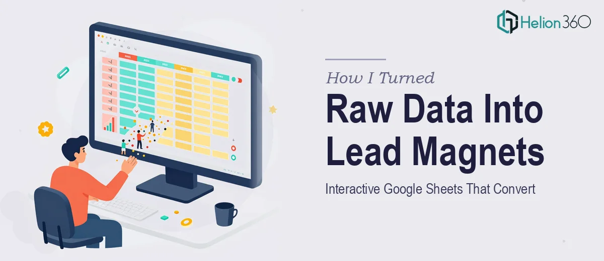
What the Final Version Actually Looked Like
The finished lead magnet was a genuinely different product from what I had been trying to build.
The opening tab gave a summary view — key numbers presented cleanly with supporting visuals. Subsequent tabs let users interact with the data in ways that were relevant to them, with conditional formatting and dropdown menus guiding the experience. Every chart served a specific purpose, and the color system was consistent throughout.
It read like a designed presentation, not a working spreadsheet. That distinction matters enormously when the goal is conversion. Someone landing on it for the first time could immediately see the value, understand the structure, and feel confident engaging with it.
Helion360 also made sure the Google Sheets presentation was easy to duplicate and share — which was a practical detail that saved us time when we started distributing it across campaigns.
What I Took Away From This
The lesson here is not that spreadsheets are hard. It is that lead magnet design requires a very specific combination of skills — data storytelling, visual design, and an understanding of how people consume content when they are deciding whether to trust a brand.
I had the data and the brief. What I was missing was the execution layer that turns raw information into something that actually works as a conversion tool. That gap is real, and it is easy to underestimate until you are staring at a flat, unconvincing version of what should have been a strong piece of content.
If you are working on a similar project — trying to turn data into an interactive Google Sheets lead magnet that does real marketing work — Helion360 is worth a conversation. They handled the parts I could not, and the end result was exactly what the project needed.