

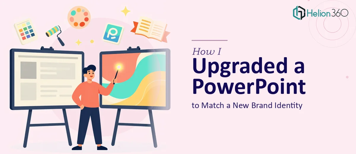
The Deck Was Fine. The Brand Had Moved On.
We had recently gone through a brand refresh. New color palette, updated typography, a cleaner logo, and a modernized visual direction. The marketing team was excited. The problem? We had an existing corporate PowerPoint presentation — about 40 slides — that still looked like it was from three years ago.
The content was solid. It covered everything we needed: company overview, service breakdown, key metrics, and client value propositions. There was no need to rewrite any of it. The only task was to bring the visual layer in line with our new brand identity.
I figured I could handle it over a weekend.
Where It Got Complicated
I opened the file and quickly realized the scope was more involved than expected. The slides weren't built on a clean master. They had mixed font sizes, inconsistent spacing, and placeholder elements that had been manually overridden at the slide level. Changing the color scheme didn't cascade cleanly — I had to go into individual shapes, text boxes, and chart fills one by one.
The charts were the real challenge. Several of them had been formatted with the old brand colors embedded directly. Updating them meant editing each data series manually. Some slides had background images that clashed with the new palette. And a few layouts simply didn't translate well to the new template structure.
After a few hours, I had made some progress — but the inconsistency was glaring. Slides 1 through 12 looked updated. Slides 13 onward still carried traces of the old look. The presentation as a whole felt patchy rather than polished.
This wasn't a task I could rush. It needed someone who works in PowerPoint professionally — not just occasionally.
Bringing in the Right Support
After hitting a wall, I came across Helion360. I explained the situation: existing presentation, new brand guidelines, no content changes needed — just a clean, consistent visual upgrade across all slides.
Their team asked the right questions upfront. They wanted the brand guidelines document, the new color hex codes, the updated font files, and clarity on whether charts and graphs should follow the new palette or be rebuilt from scratch. That level of specificity told me they understood what the job actually involved.
I handed everything over and they took it from there.
What the Upgrade Actually Involved
When I reviewed the revised file a couple of days later, the difference was immediately obvious — not in a dramatic before-and-after way, but in the way a well-put-together presentation just feels right when you scroll through it.
Every slide was rebuilt on a consistent master. The new brand colors were applied correctly across backgrounds, headers, accents, and dividers. The typography was standardized — right font, right weight, right hierarchy throughout. Charts had been reformatted to match the brand palette, and the data labels were cleaned up for better readability. Images that didn't suit the new look had been replaced with visuals that felt aligned.
Critically, the original content — every number, every line of text, every key message — was preserved exactly as it was. The update was purely visual, and that line was respected throughout.
What I Took Away From This
This project confirmed something I already suspected: presentation redesign that involves branding consistency is more technical than it looks. It's not about applying a new color to a few slides. It's about understanding how PowerPoint's master slides, theme settings, and embedded chart formats interact — and knowing where manual overrides exist and how to resolve them without breaking the layout.
For someone who does this work daily, that's manageable. For someone doing it between other responsibilities, it becomes a time sink with inconsistent results.
The Helion360 team delivered a presentation that looked like it had always been built on the new brand. That's the goal — not a retrofitted deck, but one that looks intentional from the first slide to the last.
Need Your Existing Presentation Refreshed for a New Brand?
If your company has updated its brand identity and you have presentations that haven't caught up yet, Helion360 can help you close that gap cleanly and efficiently. For teams juggling multiple collateral needs at once, see how others have managed pitch decks and proposal templates alongside broader brand rollouts.