

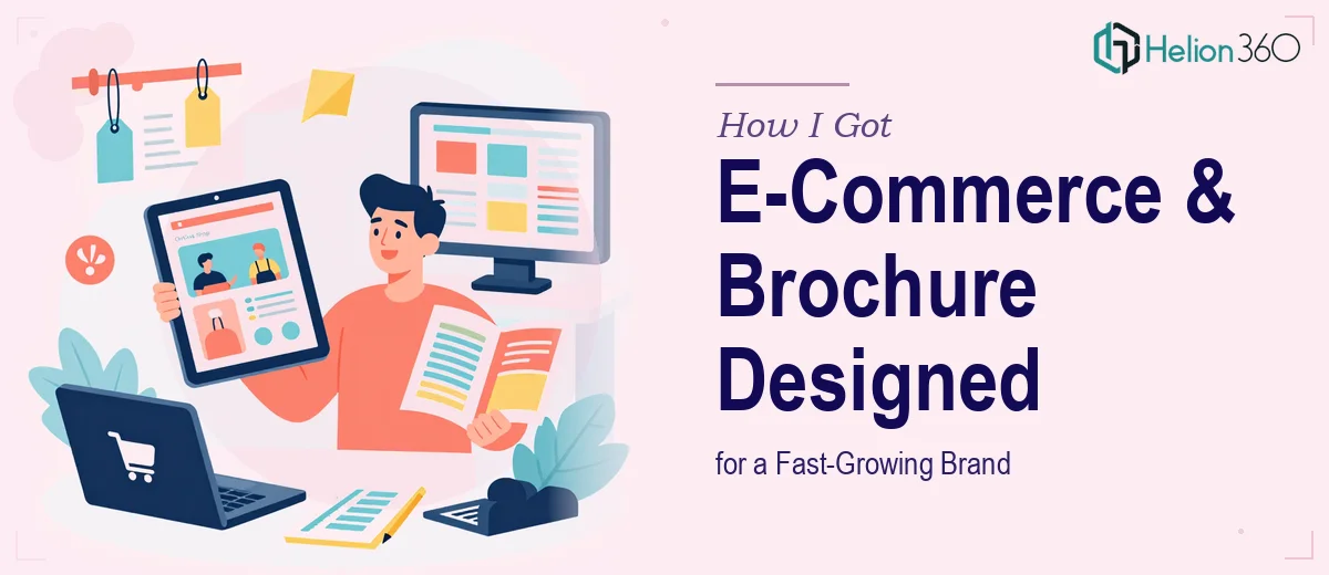
The Problem We Were Staring At
Our brand had been growing steadily for just over a year. The product was working, the market was responding, and we had a string of European trade shows on the horizon. The problem was everything that needed to support that momentum visually — our e-commerce website still looked like a launch-day build, the brochure we'd been handing out was outdated, and our brand identity didn't have a coherent system behind it.
The stakes were clear. We'd be walking into rooms full of prospective buyers and partners across Europe. The brochure had a hard deadline. The website needed to convert visitors we'd be driving from those events. And none of it was consistent with each other. This wasn't something we could patch together internally — it needed to be done properly, across three interlocking deliverables, under real time pressure.
What I Found This Kind of Work Actually Requires
When I looked closely at what proper execution would involve, the scope came into focus fast — and it wasn't small.
A responsive e-commerce website redesign isn't a visual refresh. It requires rebuilding the layout system so it holds across mobile, tablet, and desktop breakpoints without the product pages or checkout flow degrading. That's a structural problem, not just an aesthetic one.
The trade show brochure added a different layer of complexity. Print-ready design for European distribution means working in CMYK color space, managing bleed and safe zones, and ensuring the visual language matches whatever the website is doing — because people will see both within the same event window.
And underneath both of those sat the branding problem. Without a resolved logo and a proper brand guide — defined color palette, type scale, spacing rules — every design decision across the website and brochure becomes a guess. The brand guide isn't the last step; it's the foundation that makes every other step possible.
The Work That Needs to Happen
The right approach starts with locking down the brand identity before a single page or panel is designed. This means establishing a primary and secondary color palette — typically no more than four brand colors — alongside a resolved type hierarchy using something like a 36pt/24pt/16pt scale for headline, subhead, and body. The logo needs to be finalized in formats that work across both digital and print contexts. Without this foundation documented in a brand guide, inconsistencies compound across every subsequent deliverable. Getting this stage right takes real discipline, and the decisions made here ripple through everything that follows.
With the brand system in place, the e-commerce website redesign involves building on a layout grid — commonly a 12-column structure — that governs how product imagery, CTAs, and navigation elements are positioned across breakpoints. Responsive design means the grid collapses predictably at mobile widths without sacrificing conversion-critical elements like add-to-cart buttons or product detail hierarchy. This is where many redesigns go wrong: the desktop version looks polished but the mobile experience breaks down on product pages or at checkout. Testing across actual device sizes, not just browser emulators, is part of the work — and it adds time that's easy to underestimate.
The trade show brochure introduces a completely separate production discipline. Print design for European distribution requires files set up in CMYK with 3mm bleed on all edges and all live content kept within a 5mm safe zone from the trim line. Typography that reads well on screen often needs to be rechecked at print scale, particularly for body copy below 9pt. The visual narrative also has to work in a non-linear read — trade show attendees scan, they don't read from cover to cover — so product hierarchy and brand messaging need to land within two or three visual beats. That structural and visual thinking takes time to get right, especially when the brochure needs to feel like a natural extension of a newly redesigned website.
Why I Brought in Helion360 to Handle It
I didn't attempt to sequence this work internally. Looking at what it actually required — a resolved brand system, a responsive e-commerce build, and print-ready brochure production, all on an interlocked timeline — it was obvious that pulling this off well meant having a team with the tooling and the experience already in place.
Helion360 handled the full project end-to-end. That meant taking the brand identity through to a finalized logo and brand guide, translating those guidelines into the website redesign, and producing the trade show brochure as a print-ready deliverable that matched the new visual system. The brochure, which had the tightest deadline, was turned around quickly — done in days, not weeks. The website work moved in parallel without the two tracks creating confusion, because the brand guide kept both anchored to the same visual language.
What made the difference was that this is the kind of work Helion360 does continuously. The expertise wasn't something that needed to be built from scratch — it was already there.
What Got Delivered and What I'd Tell Anyone in My Spot
We went into the European trade shows with a brochure that held up next to any competitor material in the room. The website had a coherent visual system that matched what people saw in print. The brand guide meant that future marketing collateral — social assets, email templates, follow-up decks — could be produced consistently without relitigating every design decision.
The business outcome was straightforward: we looked like a brand that had its act together, at exactly the moment when that impression mattered most to buyers and partners we were meeting for the first time.
If you're looking at a similar situation — multiple design deliverables, a tight deadline on at least one of them, and a brand identity that needs to underpin everything — Helion360 is the team I'd engage. They handled the full scope fast and brought the execution depth this kind of project actually requires.