

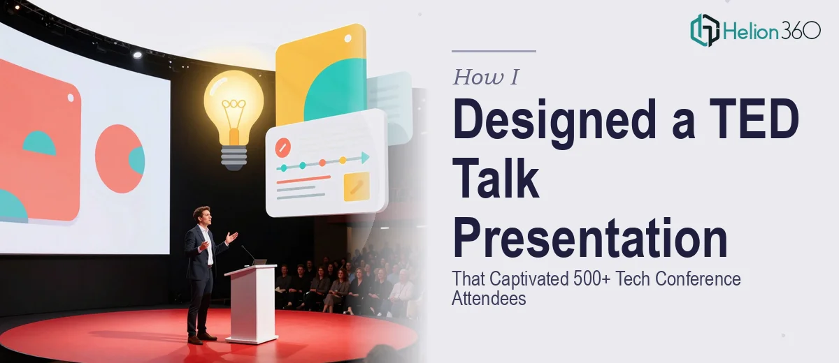
The Slides Were Ready. The Story Wasn't.
We had everything — charts, product screenshots, data points, a strong team. What we were missing was a way to make an audience of 500 tech professionals actually feel something while watching us present.
The conference was about a month out. The topic was ambitious. And our existing slides looked exactly like what they were: a competent internal document dressed up with a few gradients. Not a presentation. Not a story. Definitely not anything close to a TED talk-style experience.
I took the first pass myself. I rearranged the slide order, rewrote the headers, added a few transitions. It looked marginally better. But something was still off — the slides felt like they were fighting each other instead of building toward something. The narrative arc I was going for just wasn't there on screen.
Why TED Talk-Style Design Is Harder Than It Looks
There's a reason TED talks feel effortless. That ease is the product of an enormous amount of deliberate design work underneath. Every slide transition, every moment of visual breathing room, every text-to-image ratio is a choice. When you're too close to the content — when you've been living with the data for months — it's almost impossible to see it the way a cold audience will.
I realized I wasn't just dealing with a design problem. I was dealing with a storytelling problem wrapped inside a design problem. The slides needed to guide the audience emotionally from one idea to the next. They needed to start with a strong hook, build tension through the middle, and land on a clear, memorable close. That's not something you fix by tweaking bullet points.
I tried breaking the presentation into three-act story structure and mapping slides to each phase. That helped conceptually, but turning that framework into visually engaging, conference-ready presentation was a different kind of work entirely.
Bringing In Help at the Right Time
After about a week of iteration with diminishing returns, I reached out to Helion360. I explained the context — a tech conference audience, 500-plus attendees, a goal of creating something that felt more like a live performance than a slide report. I shared what we had and what we were going for.
Their team understood the brief immediately. They asked the right questions: What's the single idea you want the audience to walk away with? Where does the emotional peak of the presentation fall? What's the pacing of the talk — slow and reflective, or high-energy?
From there, they restructured the content flow before touching a single visual. Once the narrative backbone was solid, the design followed naturally. They rebuilt the deck with a clean, modern visual language that matched the high-tech theme without feeling cold or corporate. Slides were stripped of clutter. Key data was visualized in ways that made the numbers feel urgent rather than academic. Transitions were smooth and purposeful — every slide appeared to earn its place in the sequence.
What the Final Presentation Looked Like
The finished deck was a significant departure from what we started with. The opening slide was a single bold question — no logo, no agenda, just a provocation that set the tone immediately. From there, each section built on the last, with visual cues that created continuity across slides even as the content shifted.
The data visualization work alone changed how the audience would experience the numbers. Instead of tables and raw figures, Helion360 designed charts that told a directional story — you could see the trend before you even read the label. That's the kind of detail that separates a presentation that informs from one that moves people.
We delivered the talk to a full room. The feedback was consistent: the presentation felt polished, the story was easy to follow, and the visuals stuck. A few people specifically mentioned that it reminded them of a TED-style talk — which was exactly what we had set out to achieve.
What I Took Away From the Process
Great presentation design is not about decoration. It's about controlling what the audience thinks about, and when. Structure and visual hierarchy do more work than most people realize. If the slides are working correctly, the speaker barely has to explain — the audience is already tracking.
If you're preparing for a major presentation and your slides feel like they're holding you back rather than carrying you forward, consider business presentation design services. Helion360 took what we had, identified exactly what wasn't working, and delivered something we could walk on stage with confidence. Their approach to compelling PowerPoint presentations transforms how audiences experience your message.