

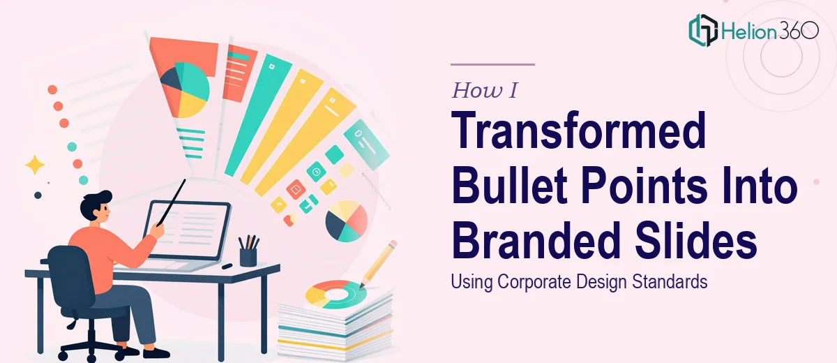
When Bullet Points Stop Being Enough
I had a stack of PowerPoint slides that technically contained all the right information. Every key message was there, every data point accounted for. But when I actually looked at them — really looked — they were walls of text. Fifteen slides, most of them nothing but bullet points dropped onto a white background with our company logo in the corner.
Ten of those slides needed to be completely rebuilt from the ground up. The other five just needed a serious refresh to bring them in line with our updated corporate graphic format. Simple enough on paper. In practice, it turned into something far more complicated.
The Problem With DIY Slide Design
I started by trying to handle the redesign myself. I opened the branded PowerPoint template our design team had put together, studied the color palette, the font hierarchy, the spacing guidelines. I understood what the slides were supposed to look like. Getting them there was another matter entirely.
Converting a dense bullet list into a well-structured, visually engaging slide isn't just a formatting exercise. It requires making decisions about content hierarchy — what gets emphasized, what gets cut, how to translate three nested sub-bullets into a single clear visual idea. For one or two slides, that's manageable. For ten slides that all needed to be rebuilt while staying faithful to corporate branding guidelines, it became a real bottleneck.
The refresh slides added another layer of complexity. They weren't blank canvases. They had existing content that needed to be preserved, but the visual treatment had to be updated without losing the logic of the original layout. Every time I thought I had one slide locked, something about it felt off — the alignment, the visual weight, the way it sat next to the slide before it.
I was burning time I didn't have on a problem that kept growing.
Bringing in a Team That Knows Corporate Presentation Design
After hitting a wall around slide six, I reached out to Helion360. I explained the scope — ten bullets-to-slides conversions plus five slide refreshes, all within a specific corporate graphic format — and shared the existing template files and content documents.
What I noticed immediately was that they asked the right questions upfront. They wanted to understand the presentation's purpose, the audience, and how strict the brand guidelines were. That told me they weren't going to just make things look pretty and call it done. They were treating it as a communication problem, not just a design task.
What the Redesign Actually Involved
The team worked through each of the ten bullet-heavy slides and restructured the content before touching the design. Dense, layered bullet points were distilled into clear headline statements with supporting visuals — icons, structured layouts, and clean typographic hierarchy that matched the corporate format precisely.
For the five refresh slides, they preserved the original content logic but updated the visual treatment to align with the newer brand standards. Font sizing, spacing, color usage, and image placement were all brought into consistency with the rest of the deck.
The result was a cohesive set of 15 slides that felt like they belonged together — not a mix of old and new, not a patchwork of different design decisions, but a single unified presentation built on a clear visual system.
What I Took Away From This
The content was always there. The brand guidelines existed. What was missing was the ability to bridge the two efficiently at scale. Rebuilding ten slides from bullet points to fully designed branded layouts isn't a task that rewards rushing, and trying to do it yourself while managing everything else that comes with a normal workday is a recipe for a mediocre result.
Good corporate presentation design isn't about decoration. It's about making sure the content lands the way it was meant to — clearly, professionally, and in a way that reflects the organization's standards.
If you're in the same position — a deck full of bullet points that needs to become something presentable, with specific branding rules to follow — Helion360 is worth reaching out to. They handled the complexity of the brief cleanly and delivered slides that were ready to use without another round of revisions. For guidance on upgrading your presentation, explore visual enhancement of presentation.
You may also find it helpful to review how others have tackled similar challenges: transforming bland presentations into captivating visual stories and redesigning PowerPoint slides with modern aesthetics.