

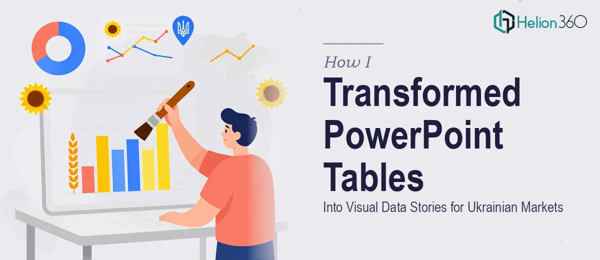
When Tables Stop Telling the Story
I was staring at a set of PowerPoint decks that were technically complete but visually exhausting. Every slide was packed with rows and columns — data arranged the way spreadsheets are arranged, not the way human beings actually read. The information was accurate, but the structure was working against us. Our audience was Ukrainian-speaking, and the context required more than just translation. It needed a full rethink of how the data was being presented.
The goal was straightforward in theory: transform these tables into a graphical, logical structure that made information easier to absorb at a glance. In practice, that turned out to be a much deeper design challenge than I had anticipated.
Why Redesigning Table-Heavy Slides Is Harder Than It Looks
My first instinct was to handle it internally. I started by pulling apart the existing slides and trying to convert the tables into simple charts and icons. The problem was that the data wasn't uniform. Some tables had categorical comparisons, others showed step-by-step processes, and a few were mixing both. A bar chart worked for one slide and completely fell apart on the next.
Beyond the structural complexity, there was the language layer. Incorporating Ukrainian terminology correctly — not just translated text, but terminology that resonated with the target market and fit naturally into the visual layout — required both linguistic precision and design sensitivity. Font rendering in Ukrainian Cyrillic can behave differently depending on the PowerPoint version, and alignment issues were appearing whenever I tried to adjust text boxes.
After two days of iteration, I had improved a handful of slides but the overall deck still lacked a coherent visual logic. The slides looked like a patchwork of different attempts rather than a unified system.
Bringing in a Team That Could See the Full Picture
At that point, I reached out to Helion360. I shared the existing decks, explained the context — Ukrainian market, table-heavy content, two-week deadline — and described what the final output needed to feel like. Their team asked a few focused questions about the audience, the brand tone, and which slides were highest priority. Then they took it from there.
What followed was a structured approach I hadn't been applying on my own. They began by auditing each table to determine what type of information it was actually conveying — comparison, process flow, hierarchy, timeline — and then chose the appropriate visual format for each category. Tables that were showing sequential steps became horizontal process diagrams. Comparative data moved into side-by-side visual blocks with clear labels. Data that showed proportions was converted into clean, icon-supported layouts that communicated quickly without losing accuracy.
The Difference a Logical Visual Structure Makes
When the revised slides came back, the first thing I noticed was how much lighter the decks felt — not because information had been removed, but because it was organized in a way that let the eye move naturally across the slide. Each visual element had a clear role. There was no clutter, no guessing about what to look at first.
The Ukrainian language integration was handled cleanly as well. The Cyrillic text sat properly within the layouts, and the terminology choices felt appropriate for the market rather than like a direct translation overlaid on an English-language design. Helion360 had clearly worked with localized presentations before and understood that language and design have to work together, not independently.
The entire set of decks was delivered within the agreed timeline. When we reviewed the output internally, the consensus was that the redesigned slides communicated the same data in a fraction of the cognitive effort the original tables required.
What I Took Away From This
This project reinforced something I already suspected but hadn't fully tested: PowerPoint redesign — especially when it involves converting complex tables into visual structures — is a discipline in itself. Knowing what chart type serves a particular data set, how to maintain logical hierarchy across slides, and how to integrate a second language cleanly without breaking the layout are all specialized skills that take time to develop.
If you're sitting on a set of table-heavy slides that aren't landing the way you need them to, Helion360 is worth contacting. They handled the complexity of this project — the data variety, the design logic, the language layer — and delivered work that was ready to use.