17May
How I Designed High-Impact PowerPoint Presentations That Made Complex Data Simple
Learn how I transformed dense, complex data into clean, high-impact PowerPoint presentations — and what made the difference in the final result.
Read More

Presentation design, digital marketing & market research for businesses worldwide.
Loading blog…
Learn how I transformed dense, complex data into clean, high-impact PowerPoint presentations — and what made the difference in the final result.
Read More
Here's how I tackled complex data visualization for a Silicon Valley startup's PowerPoint presentations — and what made the difference in the final result.
Read More
Learn how I turned raw metrics and analytics into compelling PowerPoint graphs and charts that stakeholders actually understood and engaged with.
Read More
See how a complex customer experience PowerPoint — with journey maps, data visualizations, and brand consistency — came together with the right design support.
Read More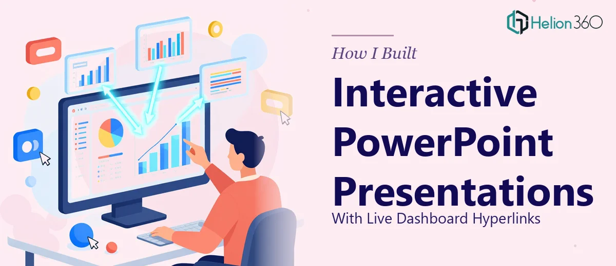
Learn how I built interactive PowerPoint presentations with live dashboard hyperlinks — and how Helion360 helped deliver a seamless, data-linked slide deck.
Read More
Learn how I tackled complex data presentation design challenges and delivered polished, professional PowerPoint slides that exceeded client expectations.
Read More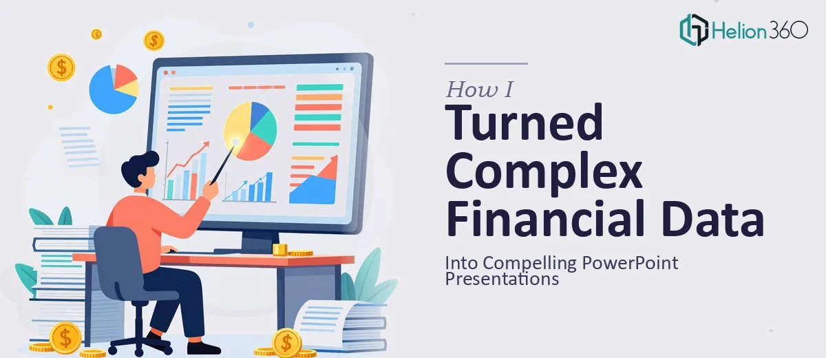
Learn how complex financial data was transformed into professional PowerPoint presentations with clear charts, visuals, and a story that actually lands.
Read More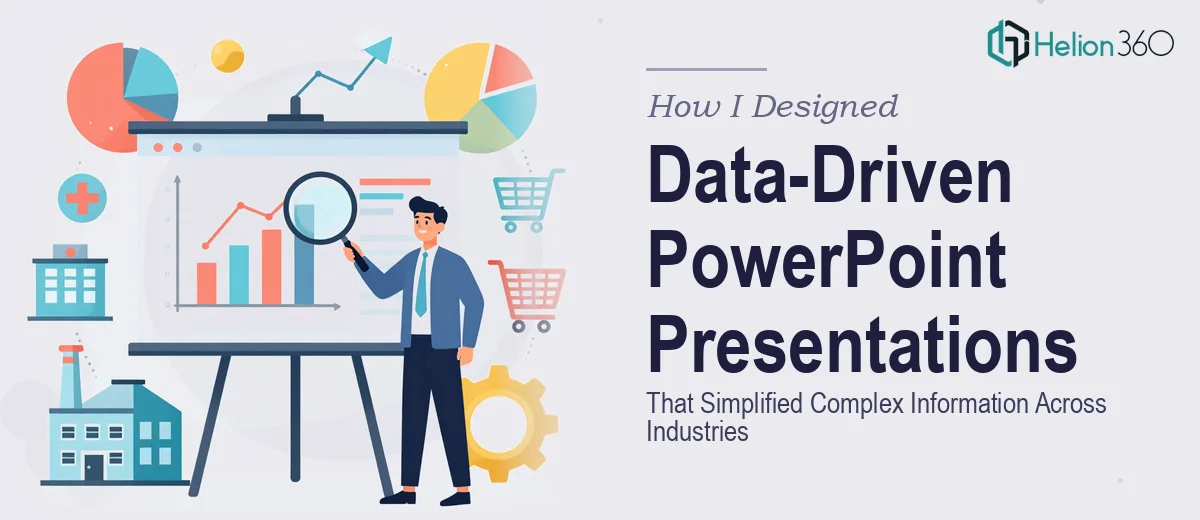
How I tackled complex, multi-industry PowerPoint design challenges and what happened when I brought in professional help to get it done right.
Read More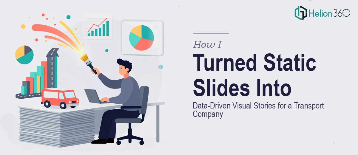
How I transformed flat PowerPoint slides for a transport company into data-rich visual stories with KPI dashboards and clear data visualizations.
Read More
How I converted a dense research document into a data-driven PowerPoint presentation for a tech conference — and what made the difference in the final result.
Read More