

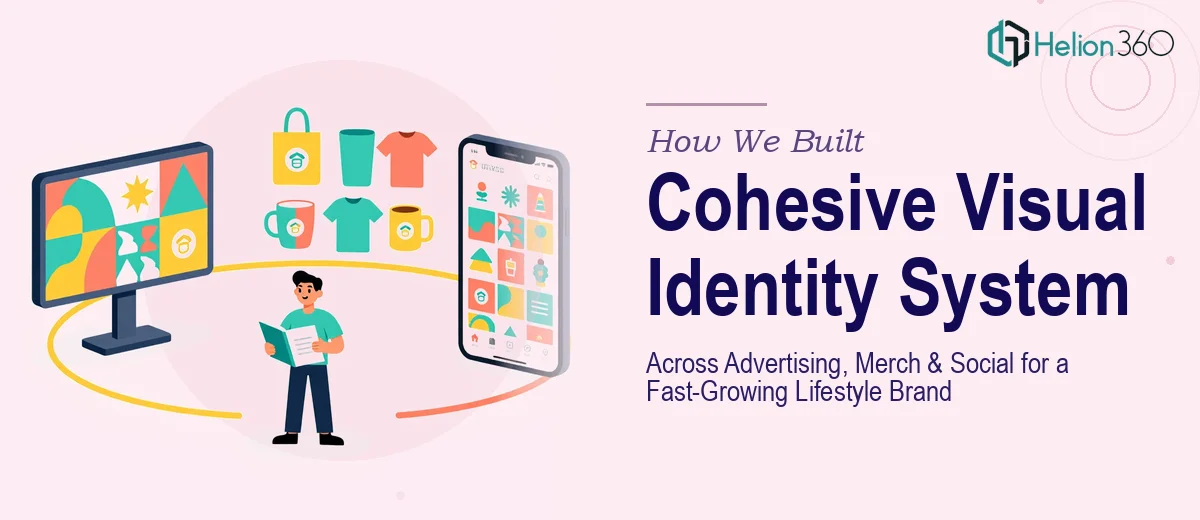
The Challenge: A Brand Pulled in Too Many Directions
When this fast-growing lifestyle apparel brand came to Helion 360, they had momentum but no visual cohesion. Their social media posts looked nothing like their print advertising. Their merchandise carried a completely different color palette than their digital campaigns. And their team was operating without a single source of brand truth — every designer, agency partner, and in-house marketer was making it up as they went.
The result was a fragmented customer experience. Audiences who discovered them on Instagram weren't recognizing the brand on a store shelf, and wholesale partners were raising concerns about inconsistent packaging. The brand had equity — it just wasn't being protected or amplified consistently.
Our Approach: System Thinking Before Style Decisions
We started by conducting a full brand audit across every touchpoint: paid social ads, organic content, print collateral, merchandise tags, packaging, signage, and email templates. What we found confirmed what leadership suspected — there were at least four unofficial "versions" of the brand living simultaneously in the wild.
Phase 1: Foundation
We facilitated a brand positioning workshop with their core leadership team to align on brand personality, tone, and audience perception goals. From that foundation, we developed a master visual identity system that included a refined primary logo suite, a locked secondary and tertiary color palette, typography hierarchy, iconography style guidelines, photography art direction standards, and a defined illustration aesthetic.
Phase 2: Application Across Channels
With the system in place, we extended it deliberately across three distinct but connected environments. For advertising — both digital and out-of-home — we created modular layout templates that maintained brand consistency while allowing campaign-level flexibility. For merchandise, we developed print-ready artwork packages that translated the identity to apparel, accessories, and packaging with material and production specs included. For social media, we built a content design system with 40+ customizable post templates, story formats, and highlight cover sets organized by content type and campaign theme.
Phase 3: Brand Guidelines Documentation
Everything was codified into a comprehensive brand guidelines document — a living resource covering correct and incorrect usage, spacing rules, color codes across print and digital formats, and real-world application examples. We also delivered a condensed one-page brand card for quick reference by external vendors and collaborators.
The Outcome: One Brand, Every Surface
Within two months of the system rollout, the client's marketing team reported dramatically faster production timelines, fewer revision cycles with external partners, and overwhelmingly positive feedback from wholesale buyers who noted the brand now felt premium and intentional on shelf. The visual consistency across social, advertising, and merchandise created a compounding brand recognition effect — audiences began associating the aesthetic immediately, building the kind of trust that drives repeat purchase behavior.