

The Challenge
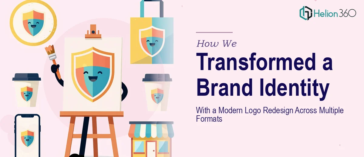
A design firm approached us with an existing logo that no longer reflected the caliber or direction of their brand. They needed more than a simple refresh — they required a complete visual overhaul that could perform across every medium their business operated in. The complexity lay not just in the creative direction, but in the technical scope: the final deliverables needed to include production-ready files in PDF, JPEG, PNG, and DXF formats, each optimized for its intended use case. Print-ready files demand precision at scale, digital formats require careful compression without quality loss, and DXF files must meet the exacting tolerances of fabrication and signage workflows. Balancing aesthetic modernization with this level of technical rigor — on a tight timeline — made this a project that required both creative confidence and technical depth.
Our Approach
Helion360 began by auditing the existing logo to identify what was worth retaining — equity, recognition, core symbolism — and what needed to evolve. The redesign process started with concept exploration grounded in the firm's positioning, ensuring the updated mark felt intentional rather than arbitrary. Once the primary direction was approved, the design was constructed in a fully vector-based environment to guarantee infinite scalability without degradation. Each file format was then prepared with deliberate attention to its end-use context: PDFs were exported in CMYK with bleed and crop mark settings for print production, PNGs were delivered with transparent backgrounds at multiple resolutions for digital and web use, JPEGs were optimized for screen-based applications with appropriate compression, and DXF files were prepared to industry-standard specifications suitable for CNC cutting, laser engraving, and large-format fabrication. Every version was tested and reviewed before delivery.
The Outcome
The client received a complete, modernized logo system with a full suite of production-ready assets spanning four file formats, each tailored to a specific use context. The refreshed mark gave the firm a cohesive, professional visual identity capable of performing consistently across print materials, digital platforms, signage, and fabricated applications. The structured delivery ensured the firm's internal team and any future vendors could immediately put the files to use without additional reformatting or technical intervention. The project eliminated the gap between how the firm presented itself and the quality of work it actually delivered.
If your brand has outgrown its current logo and you need a modern brand identity system that holds up across every format and medium, Helion360 delivers creative and technical precision in one seamless process.