

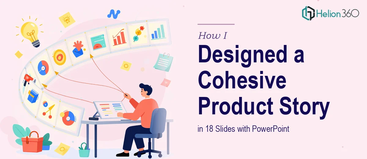
The Pressure of a Product Launch Presentation
When we were getting ready to launch our new digital product, I knew we needed more than a decent slide deck. We needed a presentation that could walk someone through a problem, show them the solution, and make the whole thing feel effortless to follow. Eighteen slides to do all of that — no pressure.
I started drafting it myself. I had the content, I understood the product, and I figured I could piece it together in PowerPoint over a weekend. That assumption cost me about two weeks.
Where My Own Attempt Fell Apart
The content was there, but the slides were not doing it justice. Each section felt disconnected from the next. The fonts were inconsistent. The icons I pulled from free libraries did not match each other visually. The flow made sense to me because I already knew the product — but when I showed it to a colleague, they had to stop me three times to ask what a slide was trying to say.
That is when I realized the problem was not the content. It was the visual storytelling. A PowerPoint presentation for a digital product launch is not just a formatted Word document. It needs a visual language — consistent branding, purposeful slide layouts, graphics that support the message rather than distract from it. That kind of design thinking takes real skill, and I was past the point of pretending I had it.
Bringing in a Team That Knew What They Were Doing
After hitting that wall, I came across Helion360. I explained what we were working on — an 18-slide PowerPoint presentation for a digital product, modern and professional, built to tell a clear story from problem to solution to value. I shared the content, our branding guidelines, and a rough sketch of how I imagined the flow.
Their team asked the right questions upfront. What was the primary audience? Would this be presented live or shared as a standalone file? Were there specific slides where we needed data visualized, and which ones were more narrative? Those questions told me they were thinking about the presentation the same way a strategist would, not just a decorator.
What the Final 18-Slide Deck Actually Looked Like
The result was a significant step up from what I had. Every slide had a clear purpose. The opening slides established the problem space with clean, minimal layouts that did not overwhelm. The middle section — covering features and how they addressed user pain points — used custom icons and structured visuals that made comparisons easy to read at a glance. The closing slides built toward a natural call to action without feeling forced.
The branding was consistent throughout. Colors, typography, and spacing all held together as one visual system. When I flipped through the deck, it felt like a single designed object rather than a collection of independent slides.
Helion360 also flagged a couple of slides where the messaging was too dense and suggested splitting the content across two slides instead. That kind of feedback — design-driven editorial thinking — was exactly what I could not give myself.
What I Learned From the Process
Building a product presentation that genuinely communicates is harder than it looks. The content is only half the work. The other half is knowing how to visualize it — how to use layout, hierarchy, and visual flow to guide someone through a story without losing them.
For a digital product launch especially, the presentation is often the first impression a potential user or stakeholder gets. A generic or cluttered deck sends a signal about the product itself, even if that signal is unintentional.
I also learned that having someone review the deck who was not already inside the product was essential. Fresh eyes catch what familiarity hides.
If you are working on a similar project — a product launch deck, a feature walkthrough, or any presentation where the story and the design both need to land — Helion360 is worth reaching out to. They handled the parts I could not, and the final deck reflected the product far better than my draft ever would have.