

The Brief Sounded Simple Enough
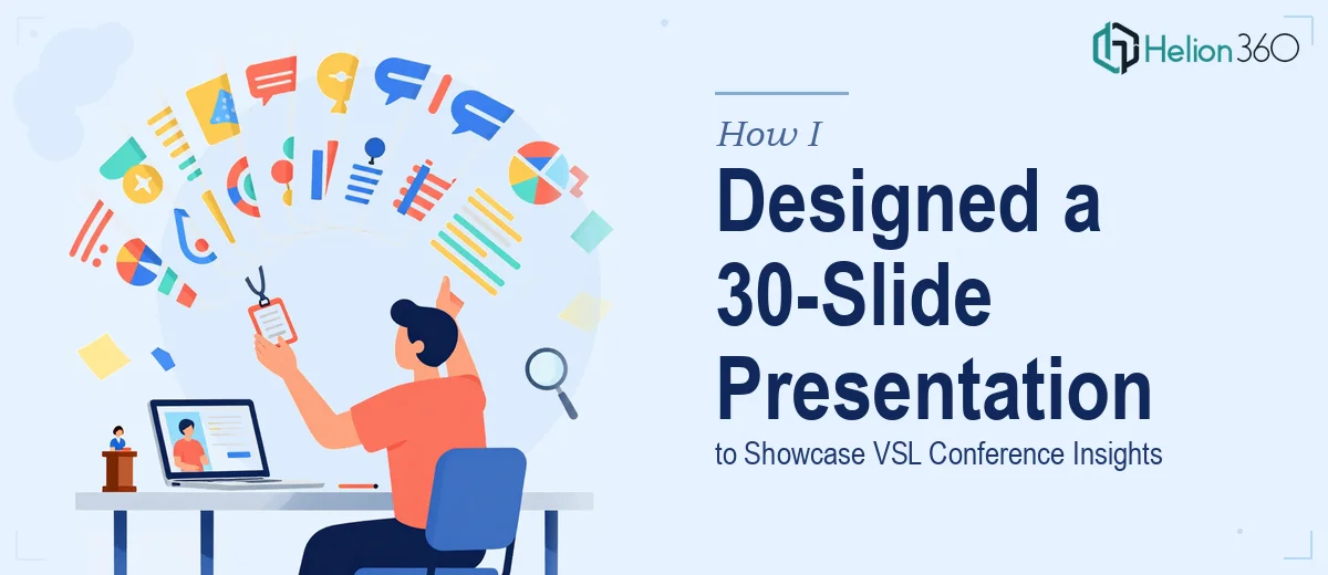
After attending the VSL conference, I was tasked with putting together an internal presentation to share everything we had learned. The goal was clear: a 30-slide Google Slides deck covering key takeaways, industry trends, insights from keynote speakers, and a few case studies that our team could actually use going forward.
On paper, that sounded manageable. I had the notes, the content, and a general sense of what needed to be communicated. What I underestimated was how much work goes into turning raw conference notes into a polished, visually engaging presentation that flows naturally from start to finish.
Where Things Got Complicated
I started in Google Slides the same way most people do — blank canvas, default theme, and a lot of optimism. The first five slides came together quickly. But once I started working through the middle section — where industry trend data needed to be visualized, speaker insights needed to be organized across multiple slides, and case study content needed its own layout logic — the cracks started showing.
I was spending more time wrestling with alignment, font consistency, and color choices than I was thinking about the actual story the presentation needed to tell. The slides looked patchy. Some felt too text-heavy. Others had too much empty space. The interactive elements I wanted to include — clickable charts, embedded video clips — were not behaving the way I expected them to in Google Slides.
I also realized that what I was building was not going to feel cohesive at 30 slides. A theme that works on slide 3 can fall apart by slide 18 if you do not have a disciplined visual system running through the whole deck.
Bringing in the Right Support
After hitting that wall, I came across Helion360. I explained the project — the conference context, the 30-slide scope, the kind of visual tone I was going for (vibrant but not flashy, professional but not stiff), and the specific elements I needed, including the interactive components and the case study slides.
Their team took it from there. I shared my notes, a rough outline, and the few slides I had already built. What came back was a complete deck presentation that actually told a story.
What the Final Deck Looked Like
The presentation opened with a strong title slide and a clean agenda layout that set expectations for the audience. From there, it moved through the VSL conference highlights in a logical sequence — event overview, keynote speaker insights, key industry trends, and then a dedicated section for case studies and best practices.
Every section had its own subtle color accent to help the audience track where they were in the deck, without making the slides feel visually chaotic. The data slides used clean, readable charts rather than raw tables. The case study slides used a consistent two-column format that balanced text and visuals well.
The interactive elements were handled properly too. Clickable navigation between sections made it easy to jump around during the actual presentation, and the video clips were embedded cleanly without disrupting the slide flow.
What I Took Away From This
Building a data-driven presentation at this scope is genuinely different from putting together a short deck for a quick meeting. The scope introduces real design challenges — maintaining visual consistency, managing information density, structuring content so it builds naturally — that are hard to manage alone, especially when you are also the person who owns the content.
The experience reminded me that the design work and the content work require different kinds of attention. Trying to do both simultaneously, especially at this scale, is where quality tends to slip.
If you are working on a similar conference-ready presentation — a conference recap, an internal knowledge-sharing deck, or anything that needs to cover a lot of ground without losing its audience — Helion360 is worth reaching out to. They handled what I could not and delivered a deck that was ready to present without a single slide needing rework.